I redesigned my personal website earlier this year. The previous iteration, which I developed by taking an existing Jekyll template and modifying it to my needs, worked well as an online resume slash blogging platform. It also looked good on desktop but its ability to adapt to smaller mobile phone screens felt lacking. Furthermore, it was not set up to display code snippets properly. This prompted me to fire up Sublime Text to revise the site. In the end, I mostly rebuilt the site from scratch, keeping very little.
In this blog post, I will explain what I kept, what I changed, and why.
What I Kept
Jekyll + GitHub Pages
GitHub pages offers free site hosting with a github.io domain. GitHub users simply need to create a repository in the pattern, username.github.io, with the index page plus other elements of the site and their index page can be accessed through username.github.io.
While a GitHub pages site may be written in pure HTML, GitHub support Jekyll, a static site generator written in Ruby by Tom Preston-Werner, one of GitHub’s co-founders. Static site generators allow users to define HTML templates separately from content which is usually written as markdown text files. Full documentation for Jekyll may be found in its official site.
Although the previous iteration of my website used Jekyll, the static site generator has evolved to include more powerful features in recent updates that I decided to make use of.
Chief among these changes are the introduction of the pages and collections in addition to the previously supported posts. Support for pages and collections means that pages need not be organized as blog posts to make them iterable within the same collection.
Furthermore, support for pages and collections makes it possible to extend Christian Fei’s search script beyond blog posts to cover and page that I wanted to make searchable within my internal site search.
What I Changed
Ergonomic Navigation
The previous version of the website had a navigation bar situated at the top of the page, with text links. While perfectly usable on desktop, this proved to be a pain to use when on mobile.
While the ubiquity of the mobile Internet has brought the world wide web to the hands of billions the world over, mobile’s smaller screen size makes it necessary to rethink how websites are laid out. Design must be mobile first.
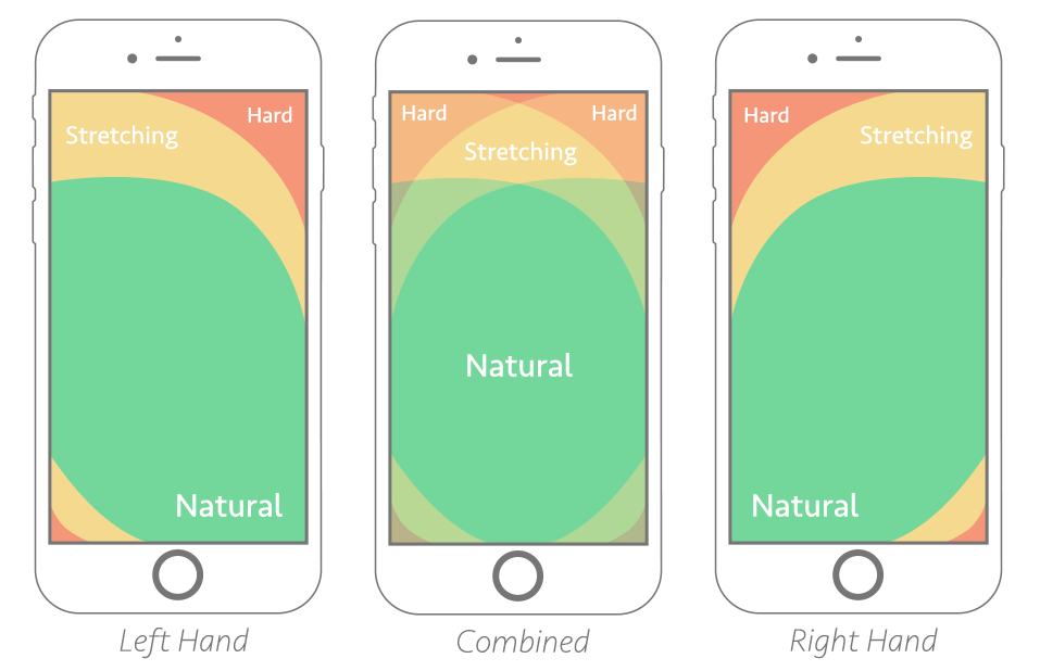
This means that all mobile navigation must be large enough to be accurately pressed on a touchscreen and located in the so-called thumbzone where users can easily reach them without overextending their digits.
The new site’s navigation bar is therefore moved downward to the bottom of the screen when the site is viewed on mobile - something easy to implement thanks to CSS media queries.
Furthermore, I have added icons to the navigation buttons using GitHub’s Octicon Jekyll plugin. These icons serve the dual purpose of acting as visual shorthand for links to common site pages (such as home and search) and expanding the button size to make them easy to press accurately on smaller mobile screens.
Almost everyone on the Internet is familiar with how to use search engines, so I added a search function to my site’s main navigation bar to make it easy for users to unearth pages by typing keywords instead of digging through menus. My site’s search functionality is an implementation of Christian Fei’s Jekyll search which uses Jekyll to automatically create a searchable JSON file of page tags and links based on post front matter which are then filtered using client-side JavaScript.
Although I was tempted to employ an expanding hamburger menu, research from UX/UI experts show that exposing all buttons has a significant positive impact on conversion rates leading me to opt for displaying all navigation links at once. For similar reasons, I also discarded the JavaScript code I had which hid the navigation bar when scrolling down - while digital natives can easily infer that they can bring back the navigation bar by scrolling up, I did not want to make my site unnavigable for those who were less familiar with common web UX patterns. This is at the price of giving my site’s main content less screen real estate, but I think this is a fair price to pay for easy to understand navigation.
Jupyter Notebook Hosting and Syntax Highlighting
Jekyll has built-in syntax highlighting through Pygments, which intelligently tags code elements within codeblocks for them to be styled in CSS. I used Pygments for syntax highlighting, using the thankful_eyes theme.
Most of my code prototypes are built as Jupyter notebooks and it is straightforward to convert these interactive notebooks to Jekyll-readable markdown using the NBConvert Jupyter extension. This greatly improved the efficiency of my content creation process.
All exported Jupyter notebooks are post-processed by adding the necessary front matter and the appropriate CSS styles to markdown elements such as data tables.
To see an example of this, please see my post on color palette creation using K-means.
Magazine Cover Headers
I felt that the previous version of the site was too text-centric. Graphical content dominates the modern web and blocks of text no longer draw user interest the way they once did. Apart from sprinkling images and other content within my blog posts, I also added magazine cover-style headers to my HTML blog post layout. For the design, I drew inspiration from sites such as The Outline and Huff Post’s Highline.